

Welcome to our Branding & Design Case Studies page, where we showcase the vital role branding and design play in a successful marketing strategy. Effective branding is more than just a logo; it permeates every aspect of a business’s identity and customer experience. From consistent colors, typography, and imagery to messaging that evokes emotions, branding shapes how your audience connects with your brand. It also reflects the company’s mission, values, and culture, making it a key element in every product or service we create. Explore our case studies to see these principles in action.
BRANDING & DESIGN
CASE STUDIES:

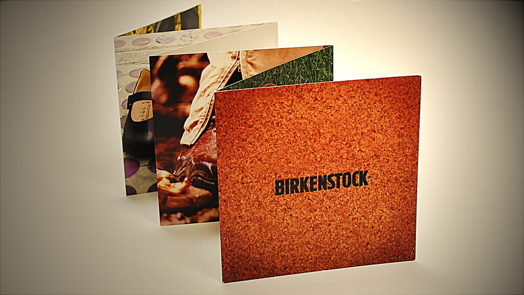
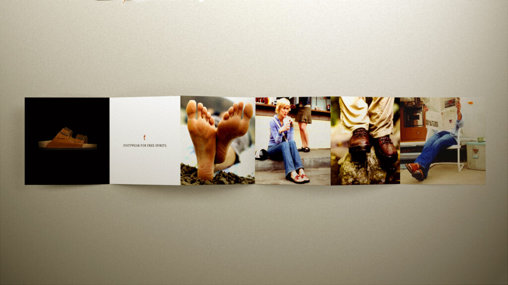
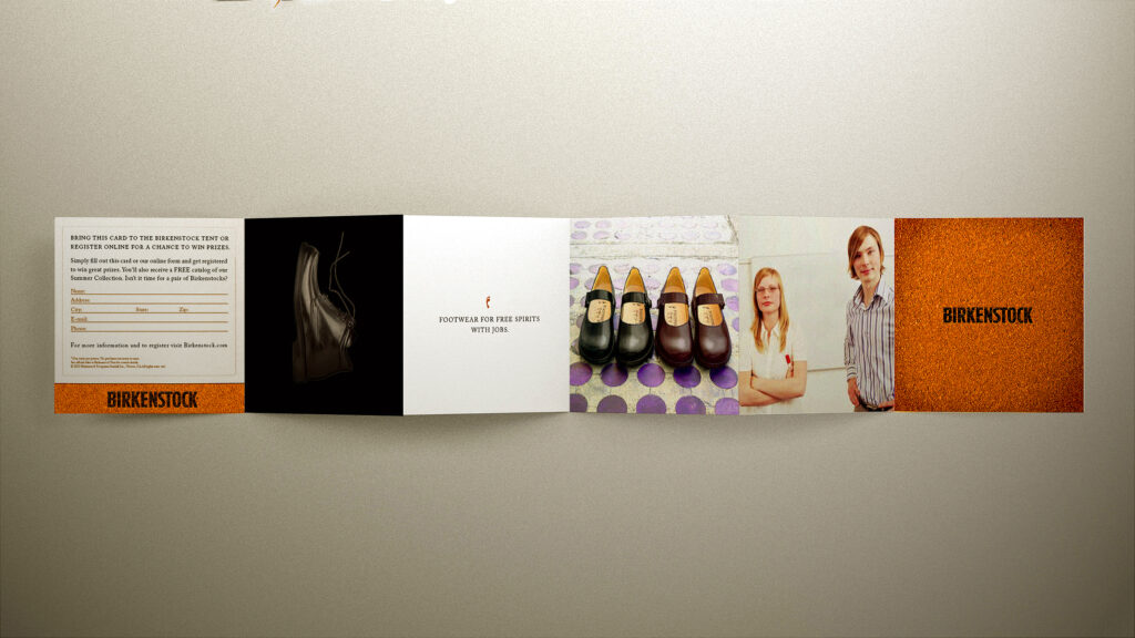
BIRKENSTOCK
Collateral
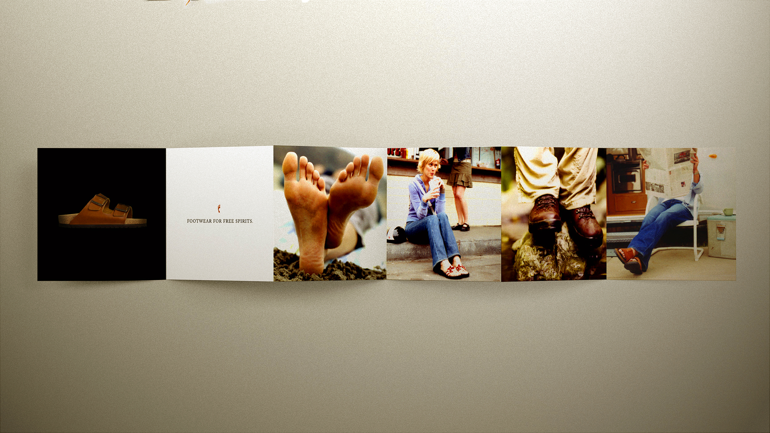
CHALLENGE: Birkenstock, the iconic footwear company, wanted to create a promotional item for distribution at major music festivals like Bonnaroo. The goal was to design a compact, visually appealing giveaway that was easy to carry while effectively reinforcing Birkenstock’s brand positioning and increasing engagement with potential customers.
SOLUTION: We created a sleek, compact, double-sided 6-panel accordion-style brochure that effectively showcased Birkenstock’s brand positioning while highlighting its latest styles. The design incorporated an incentive mechanism to capture prospect data and drive website traffic. This strategic approach boosted brand engagement.
BIRKENSTOCK
Collateral
BIRKENSTOCK
Collateral Side 1
BIRKENSTOCK
Collateral Side 2

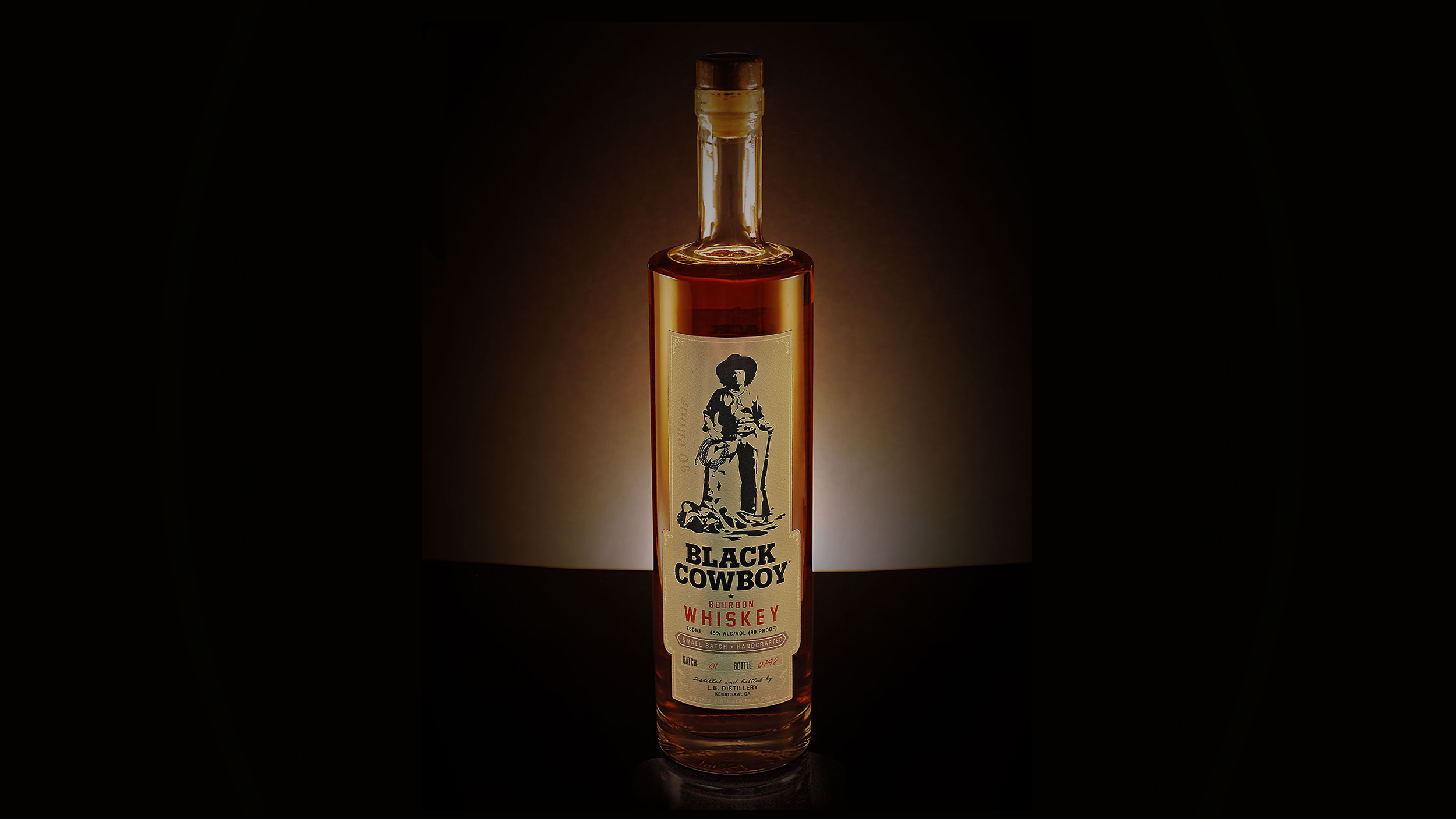
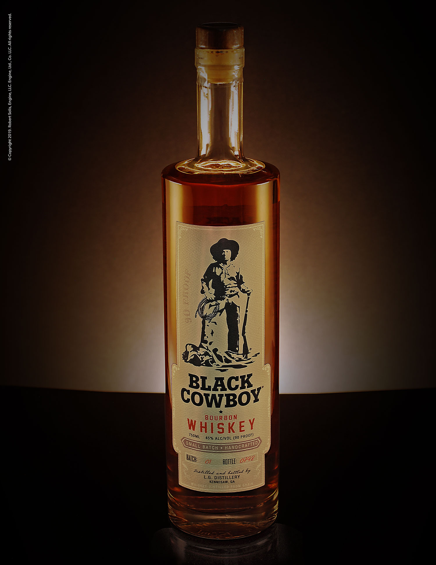
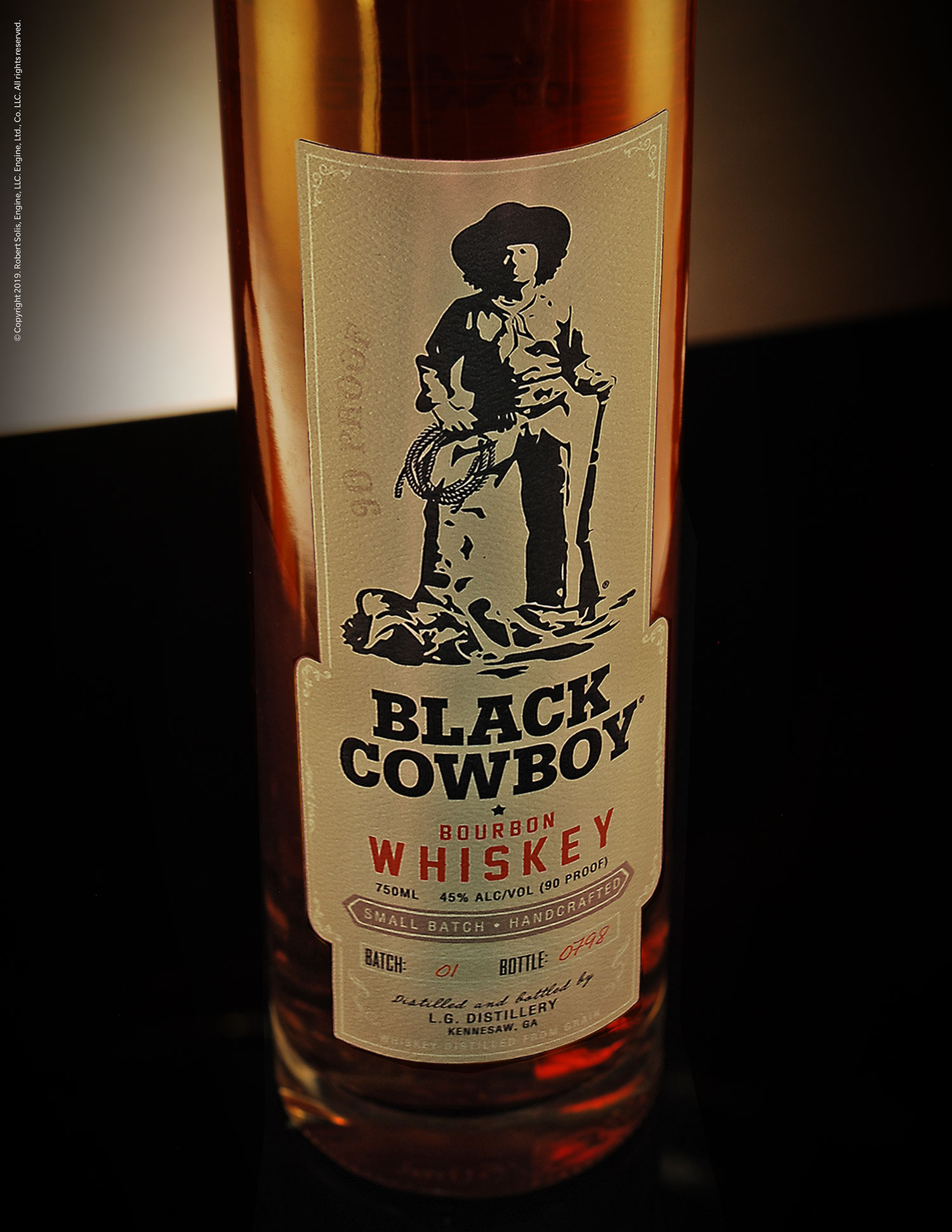
WE TV NETWORK
Branding / Design
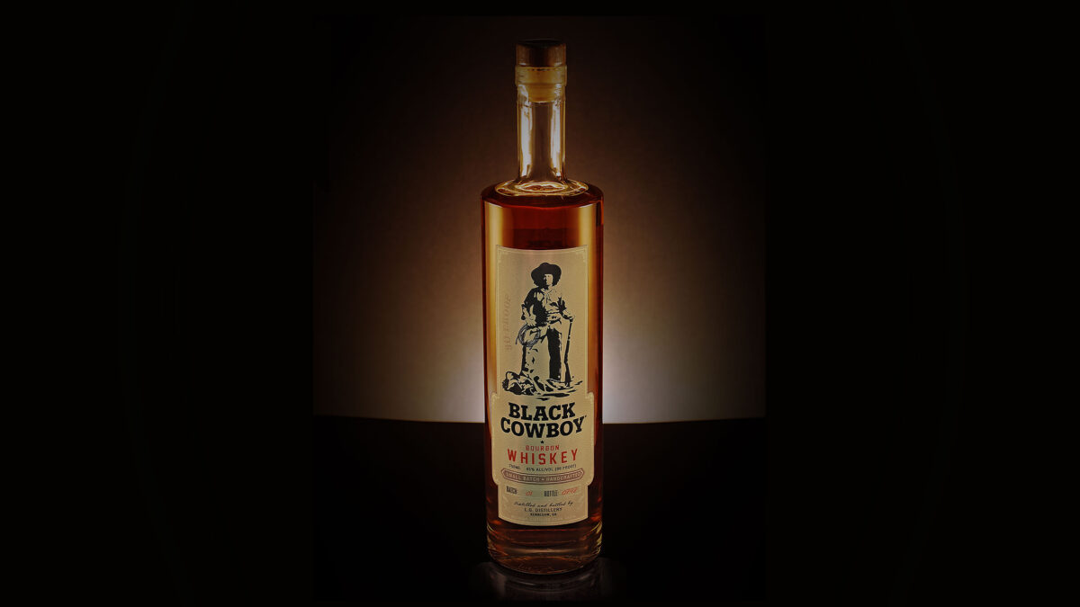
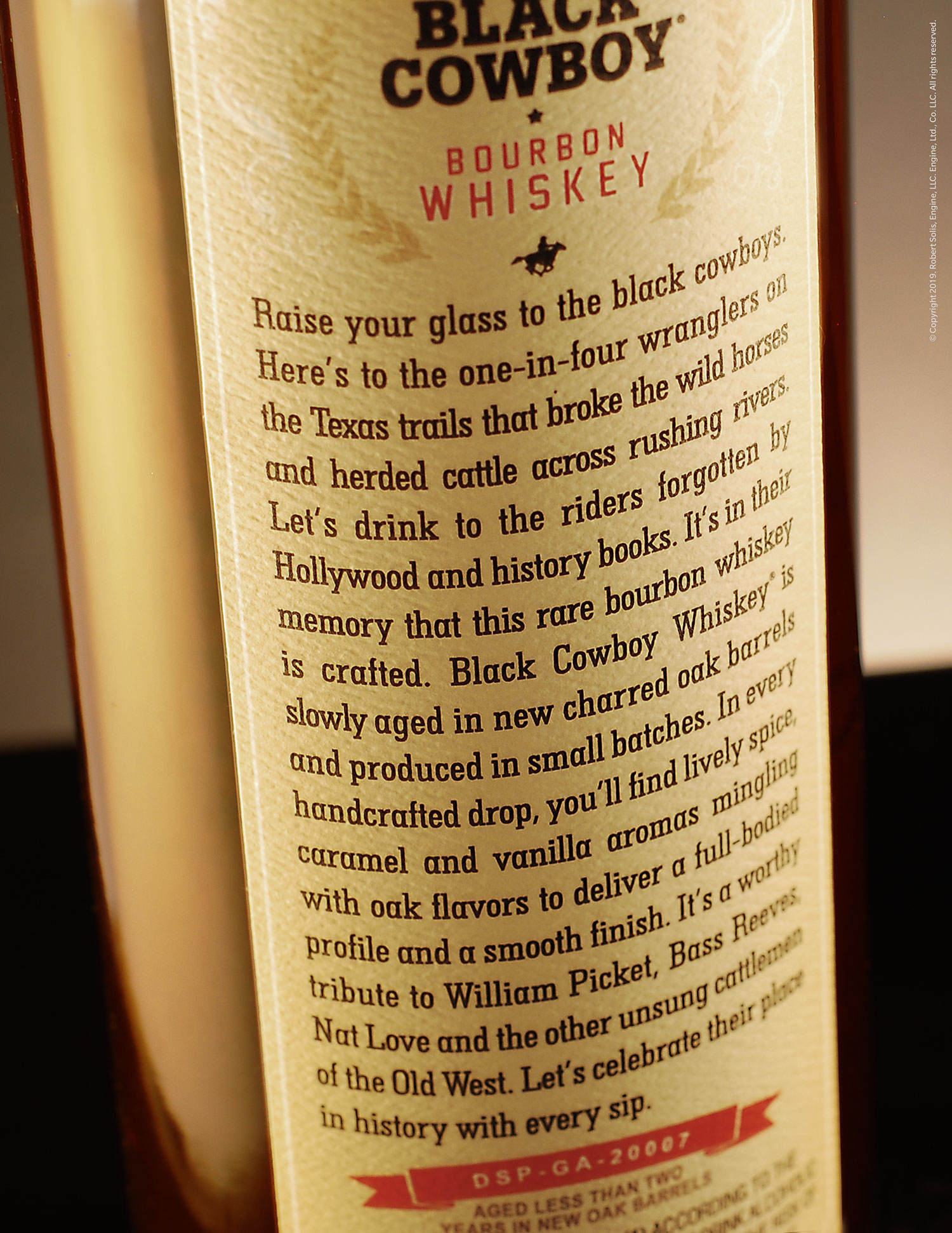
CHALLENGE: WE TV, a leading entertainment network known for its reality and lifestyle programming, needed branding and packaging design for a prop featured in its hit show, “Braxton Family Values.” The product, Black Cowboy Whiskey, was set to play a pivotal role in the season’s storyline, requiring a visually compelling and authentic design.
SOLUTION: We developed the branding, copy, and packaging for Black Cowboy Whiskey, blending the rich whiskey-making tradition with the history of African-American cowboys from the Old West. The result was a striking and culturally resonant brand that enhanced its presence and generated strong audience interest and engagement beyond the show.
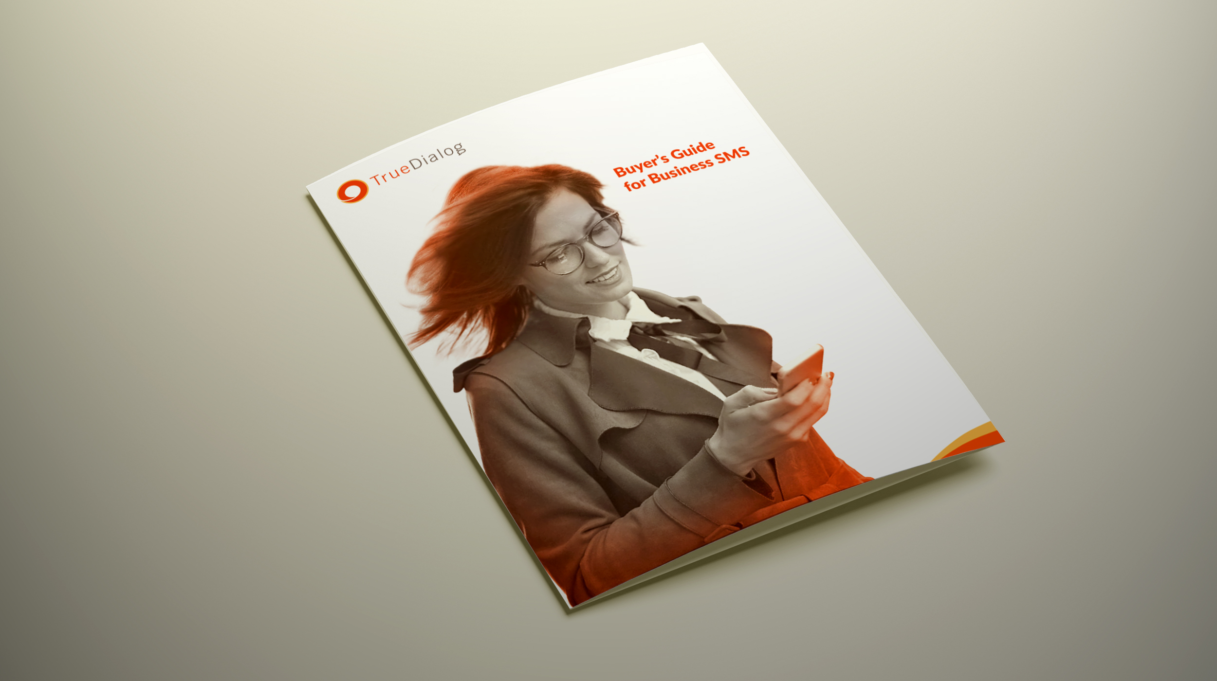
TRUEDIALOG
Branding / Design / Corp. ID.
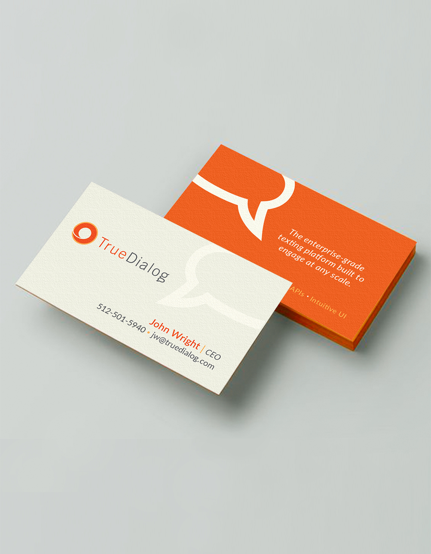
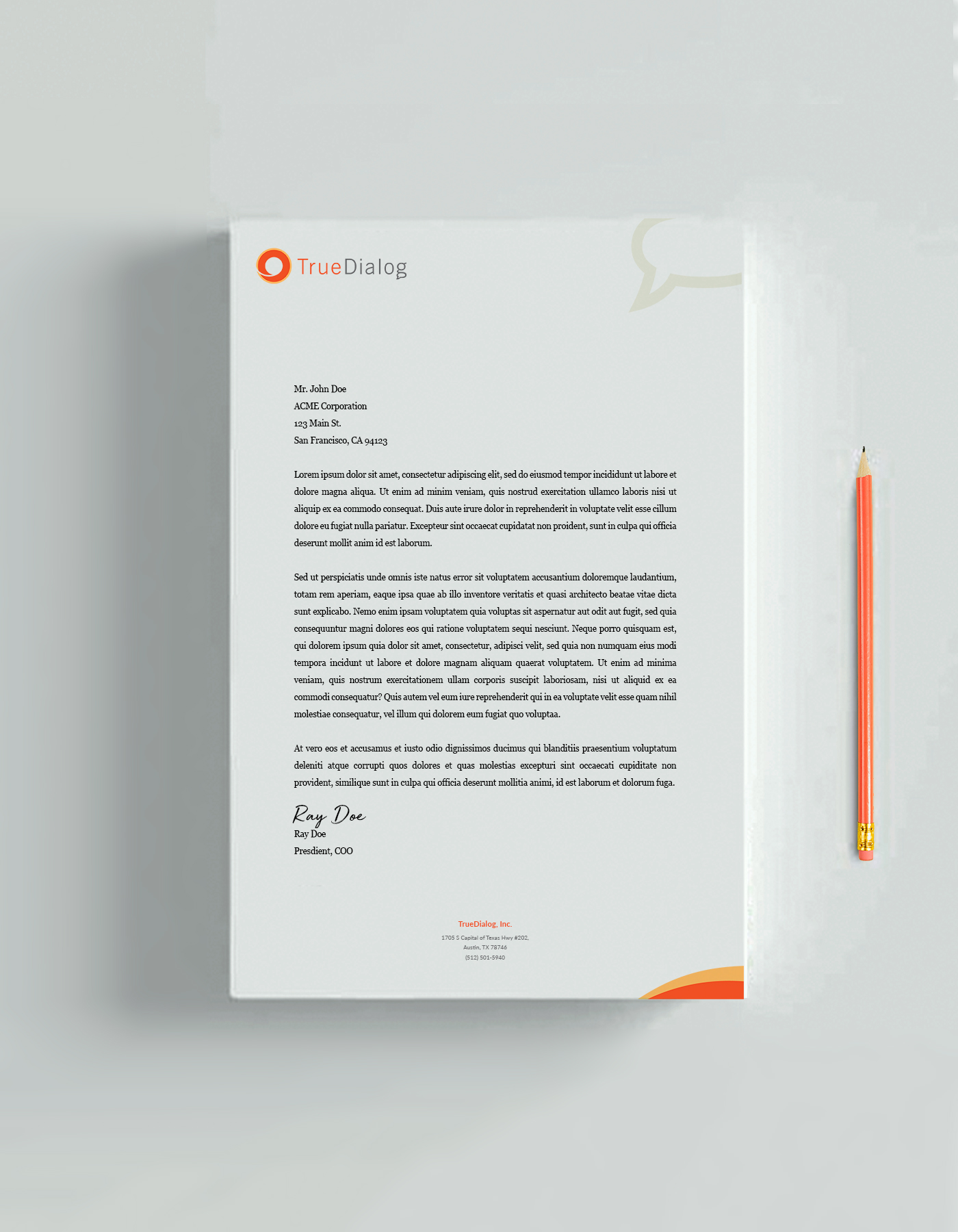
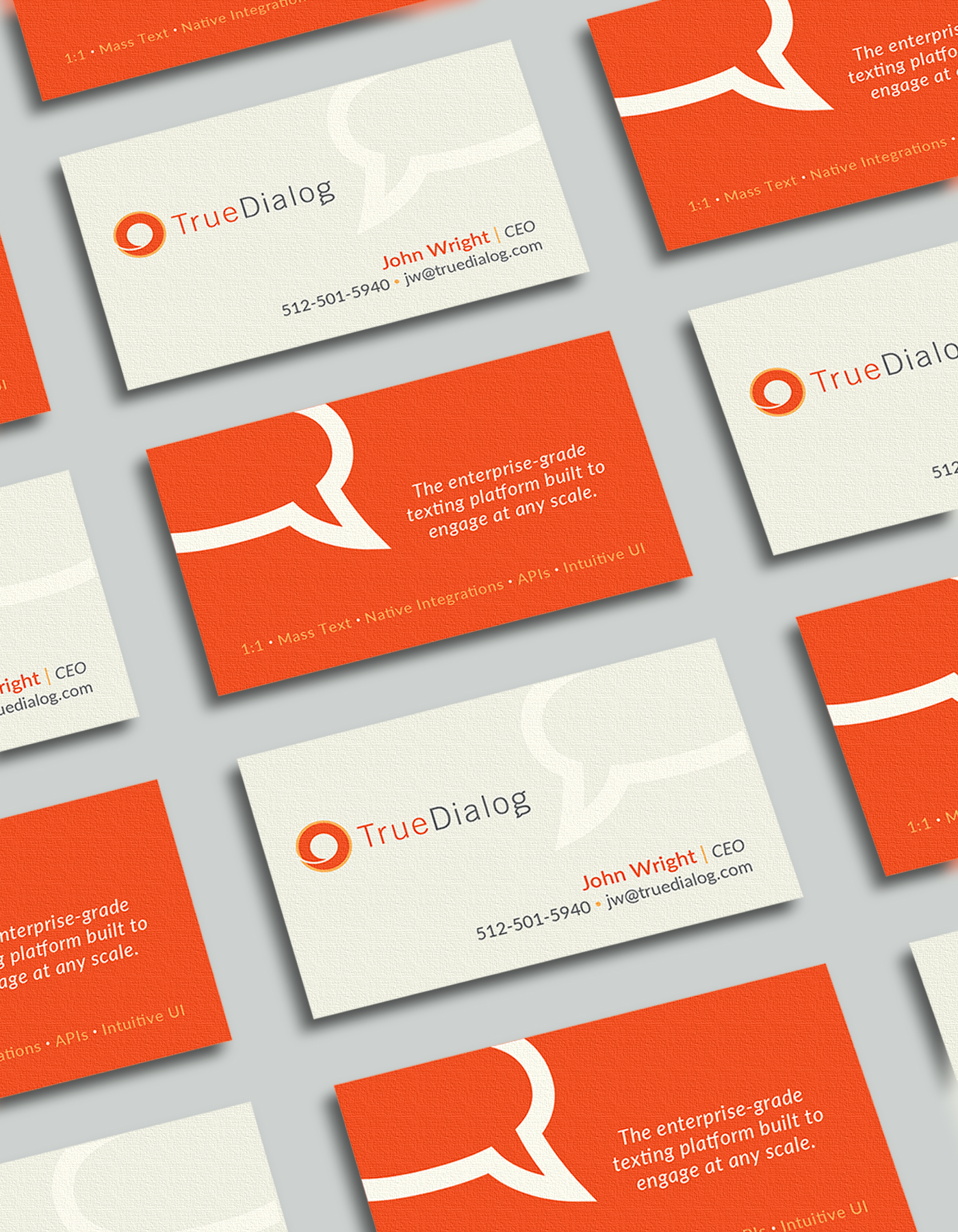
CHALLENGE: TrueDialog, a provider of enterprise-grade SMS and text messaging solutions, recognized that its branding had remained unchanged for an extended period and sought a revitalized visual identity. The goal was to modernize the brand, ensuring a fresh yet familiar look that resonated with both existing and new customers.
SOLUTION: We created a refreshed brand identity for TrueDialog, incorporating modern design elements that reflected its enterprise-grade messaging solutions while clearly communicating its core business. The updated branding was sleek, legible, and visually engaging, striking the perfect balance between innovation and brand continuity.
TRUEDIALOG
Corporate ID
TRUEDIALOG
Branding 1
TRUEDIALOG
Branding 2

TRUEDIALOG
Collateral
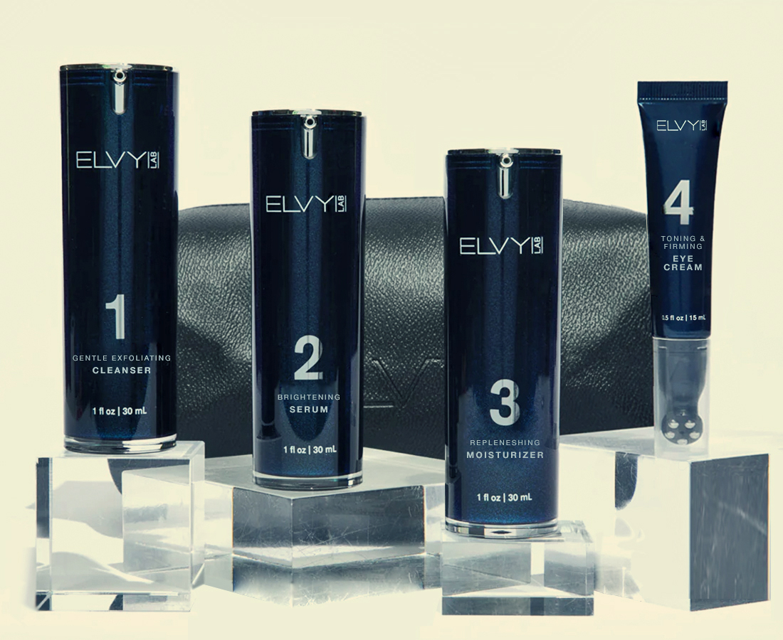
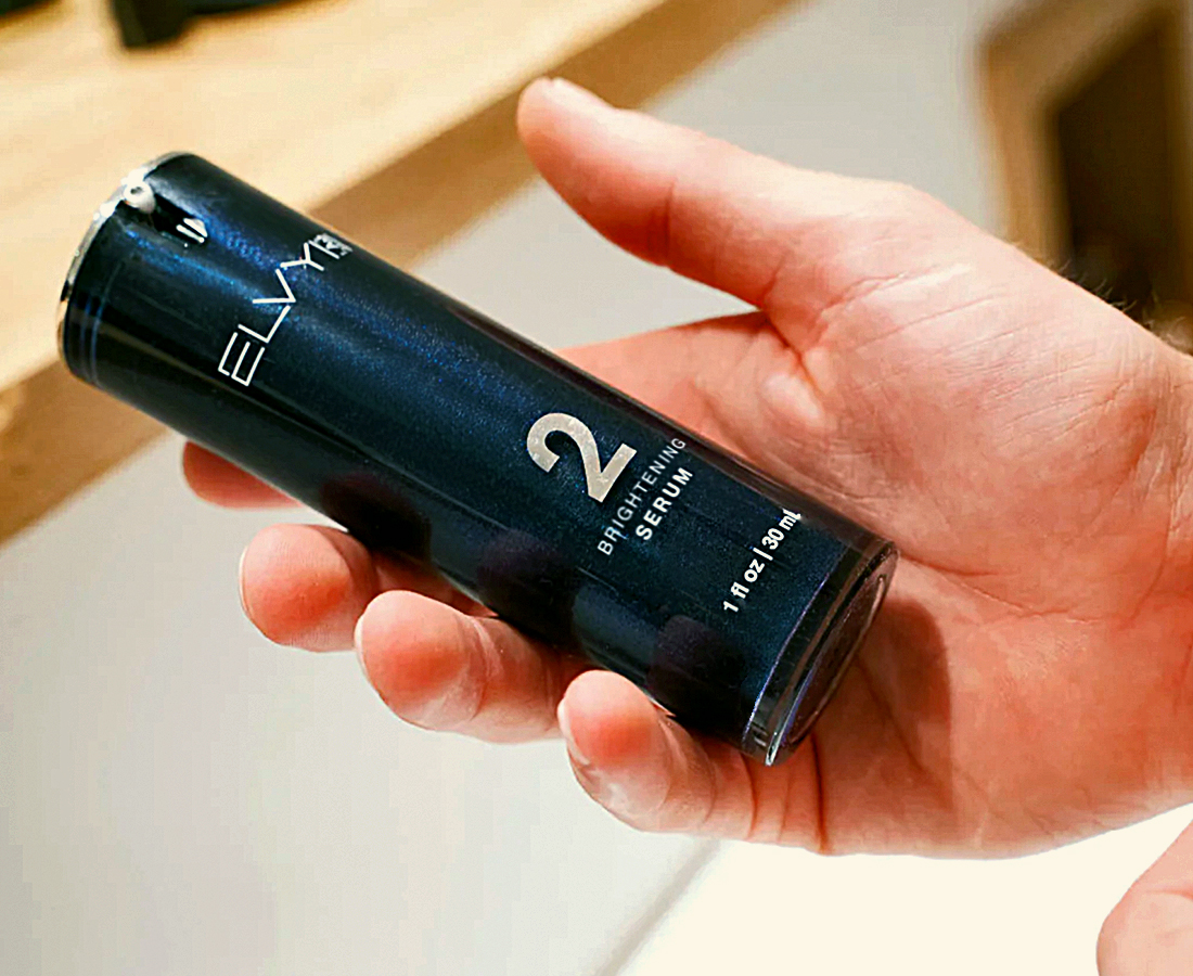
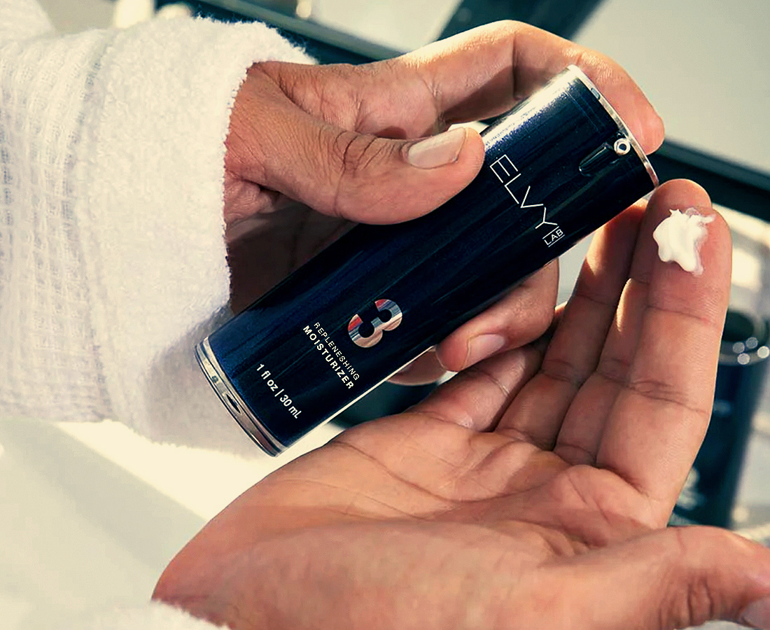
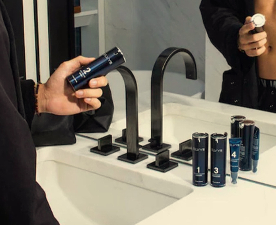
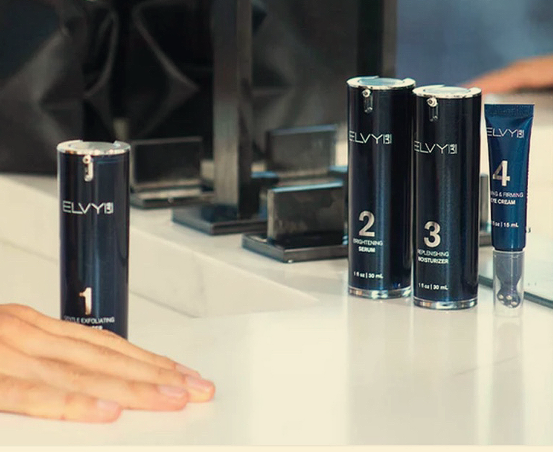
ELVY LAB
Branding / Design / Corp. ID / Packaging
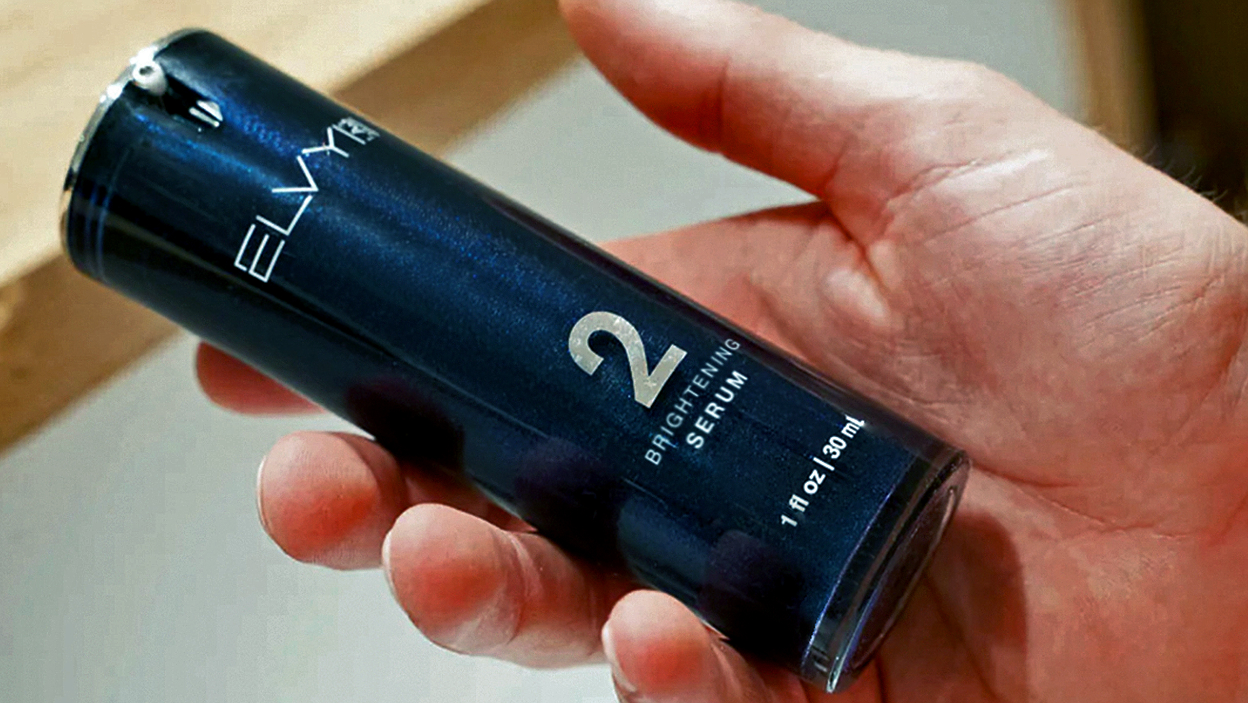
CHALLENGE: ELVY LAB, an innovative beauty and wellness company for men, needed a comprehensive brand development strategy, including corporate identity, packaging design, and compelling pitch materials to attract investors and secure funding for its product concept, with a tight timeline for a 2022 launch.
SOLUTION: We developed ELVY LAB’s branding and corporate identity, seamlessly incorporating it into their pitch materials to enhance investor appeal. Simultaneously, we designed sleek, user-friendly packaging aligned with the brand’s aesthetic and market positioning. The result was successful and set the stage for a strong market launch.
FACT:
Statistics demonstrate the profound impact of branding and design on the success of a brand. According to a survey by Nielsen, 59% of consumers prefer to buy brands they are familiar with, emphasizing the importance of effective branding in building recognition and trust. Furthermore, research by the Design Management Institute found that design-driven companies outperformed the S&P 500 by 219% over a ten-year period, highlighting the financial impact of investing in design. In the digital age, where first impressions are often formed online, a study by Stanford University reveals that 75% of users judge a company’s credibility based on its website design, underscoring the pivotal role design plays in shaping consumer perceptions and maintaining a loyal base of followers and users.
branding & design • VID branding & design • branding & design • branding & design •
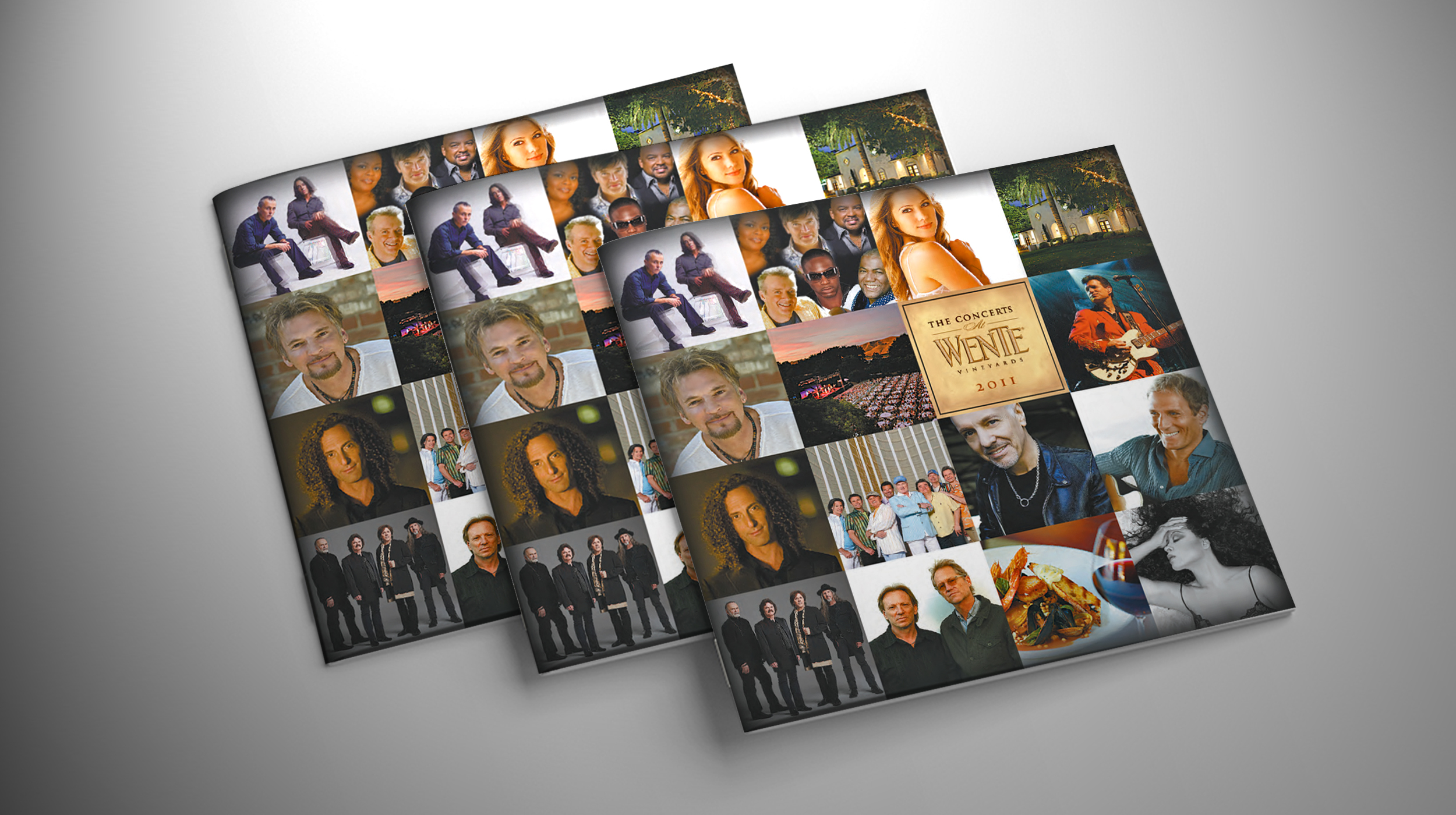
WENTE FAMILY ESTATES
Branding / Collateral
CHALLENGE: Wente Family Estates, a historic, family-owned winery known for its award-winning wines and hospitality experiences, needed a program brochure for its renowned Summer Concert Series. The challenge was to showcase all performing artists equally, ensuring a balanced presentation and maintaining brand identity and a premium aesthetic.
SOLUTION: We designed a versatile and sophisticated checkerboard-style layout, allowing Wente Family Estates to easily update artists for future Summer Concert Series while maintaining brand consistency. The elegantly crafted interior pages seamlessly aligned with the winery’s broader advertising efforts, resulting in a polished, cohesive program.
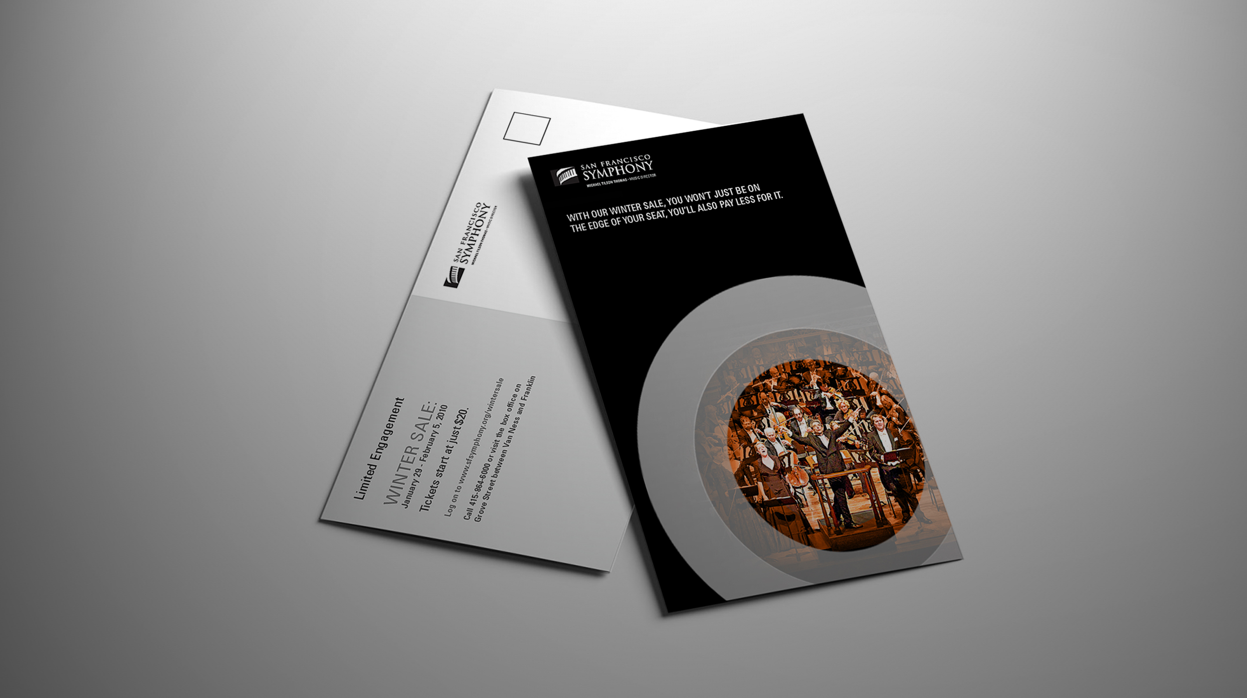
THE SAN FRANCISCO SYMPHONY
Branding / Collateral
CHALLENGE: As the holiday season approached, the San Francisco Symphony, one of the nation’s premier orchestras, faced a shortfall in meeting its membership goals. To drive last-minute subscriptions, they needed a compelling direct mail campaign to engage their audience and effectively boost membership sign-ups before year-end.
SOLUTION: We designed a “Winter Sales Event” mailer, emphasizing the benefits of securing San Francisco Symphony tickets immediately rather than waiting. The visually striking piece was swiftly developed, produced, and distributed to targeted audiences, effectively capturing attention and driving a strong surge in membership subscriptions.
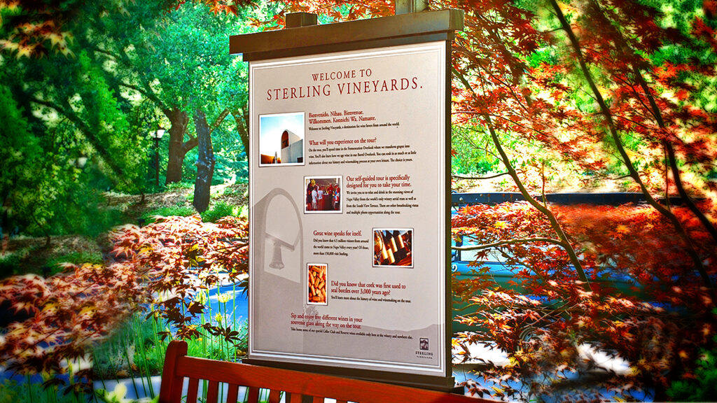
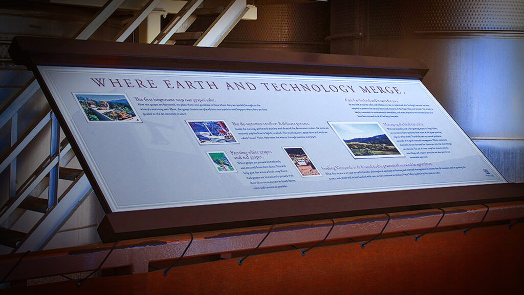
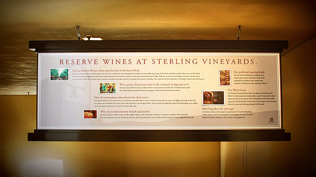
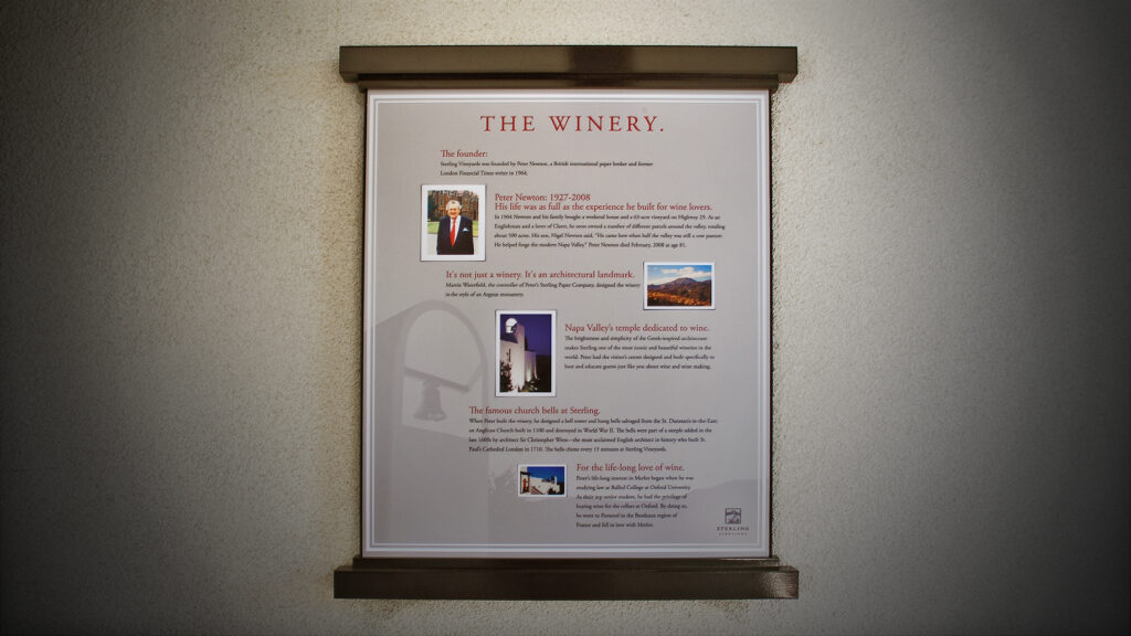
STERLING VINEYARDS
Branding / Signage / Storytelling
CHALLENGE: Sterling Vineyards, a prestigious Napa Valley winery known for its iconic aerial tram and immersive wine experiences, sought to modernize its self-guided tour. The existing tour featured outdated informational signage, often leaving visitors uncertain about their route through the property.
SOLUTION: We designed a comprehensive series of informational signage that was both educational and visually engaging, seamlessly aligning with Sterling Vineyards’ brand identity. Additionally, we produced companion videos to enhance the storytelling and immerse visitors in the winery’s rich history and craftsmanship.
STERLING VINEYARDS
Signage 1
STERLING VINEYARDS
Signage 2
STERLING VINEYARDS
Signage 3
STERLING VINEYARDS
Signage 4
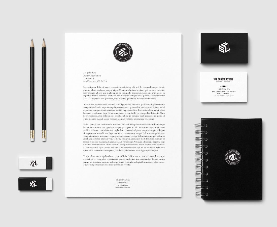
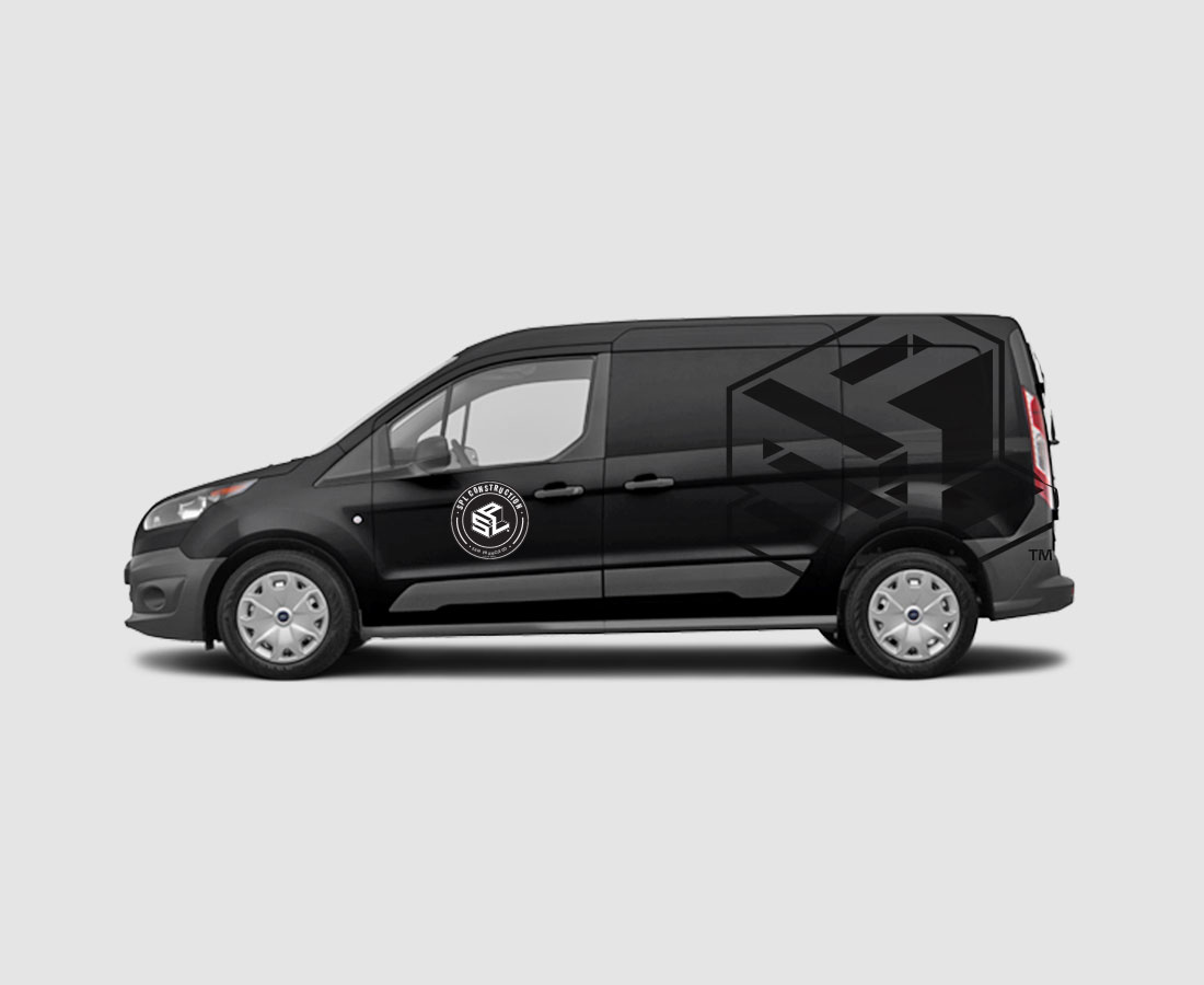
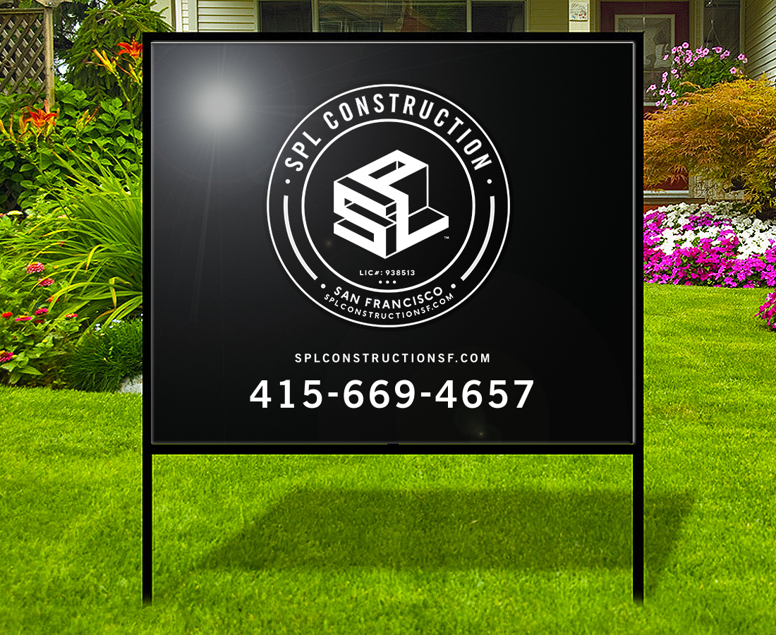
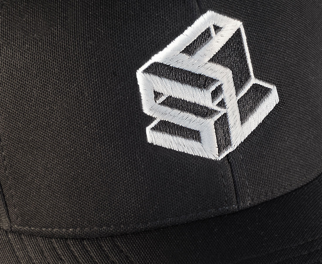
SPL CONSTRUCTION
Branding / Corporate ID
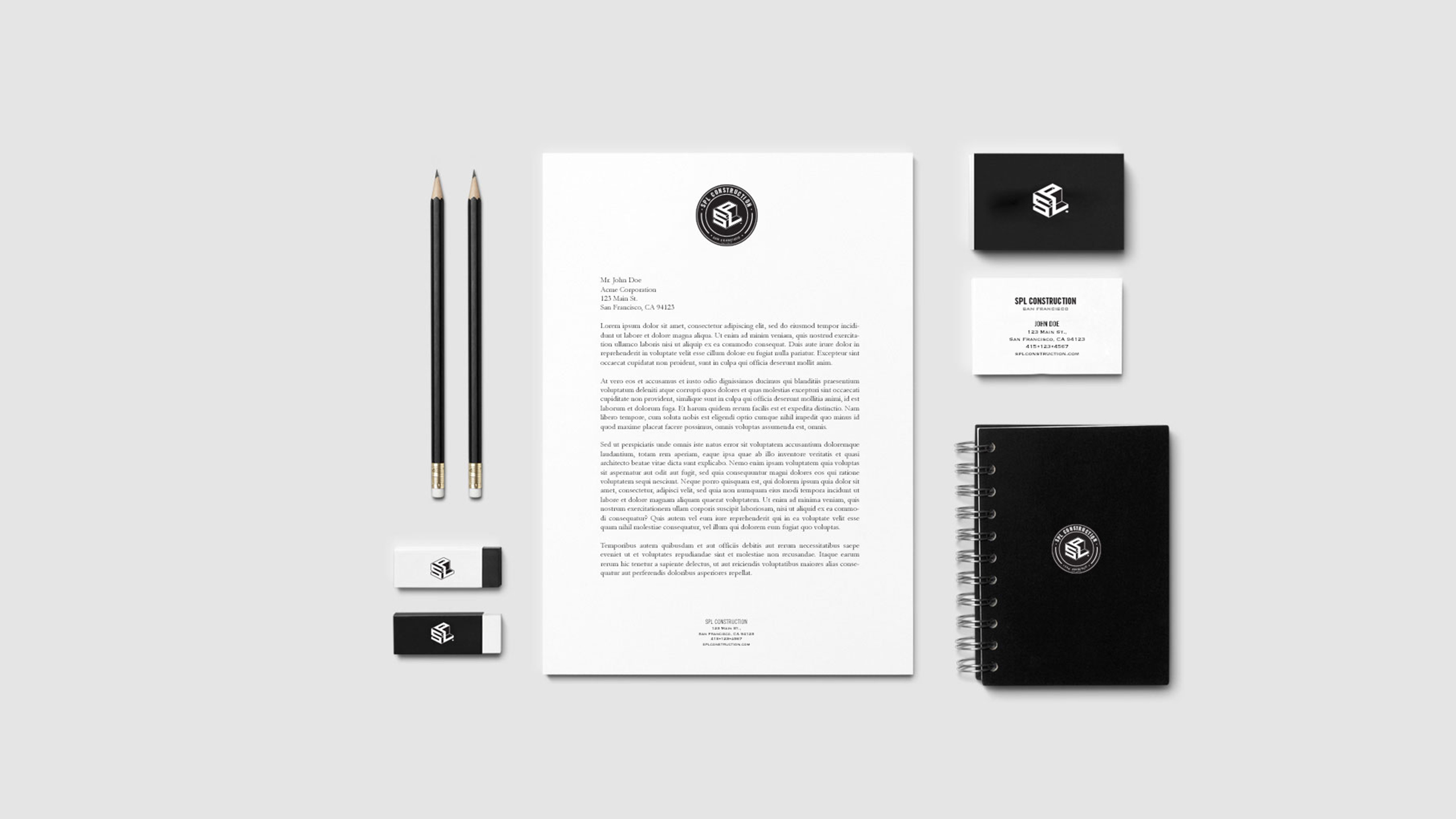
CHALLENGE: SPL Construction, a San Francisco-based luxury residential and commercial construction firm, sought a comprehensive rebranding initiative to modernize its corporate identity. This included developing a refined, sophisticated logo that accurately reflected its expertise in high-end craftsmanship.
SOLUTION: We designed a logo that perfectly encapsulated SPL Construction’s expertise and commitment to excellence in construction while developing a cohesive brand identity with refined design elements and a sophisticated color palette. This seamless integration resulted in a stronger brand presence, reinforcing a reputation for quality craftsmanship.
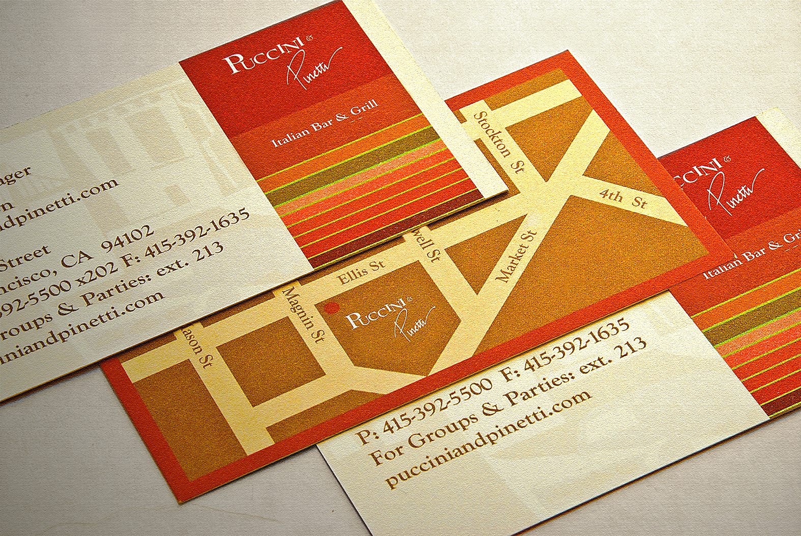
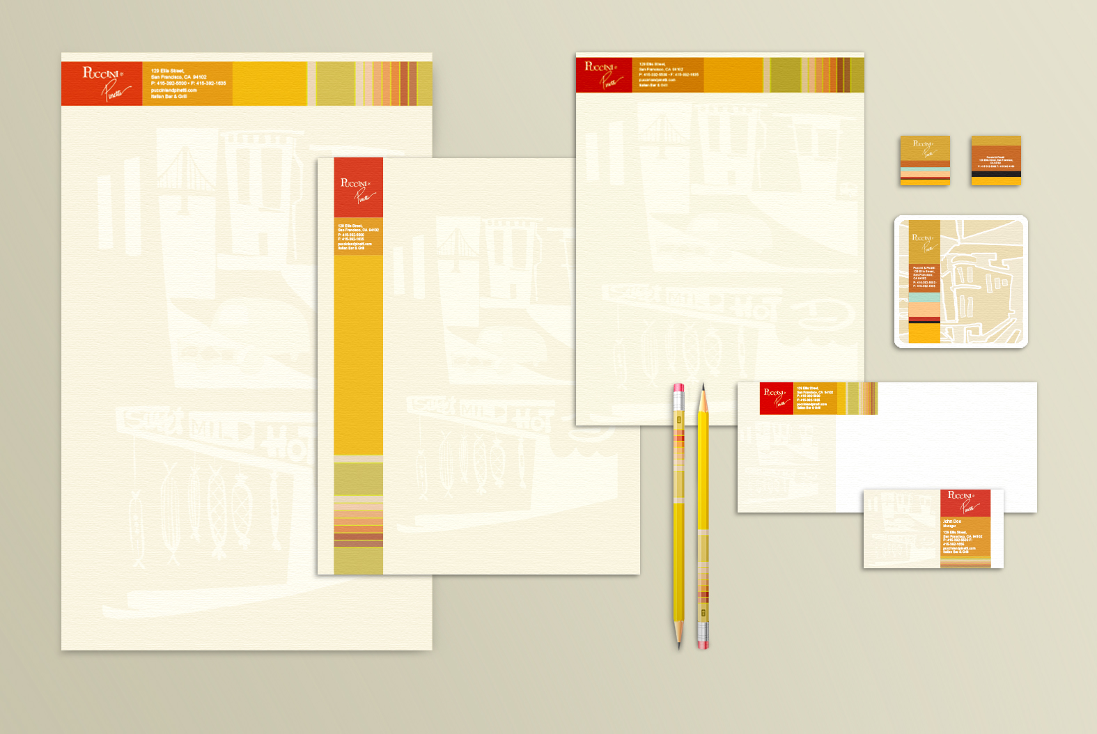
PUCCINI & PINNETI
Branding / Collateral
CHALLENGE: Puccini & Pinetti, a beloved San Francisco Italian restaurant, sought to refresh its brand identity to align with a comprehensive renovation and modernization of its space. The goal was to create a visual identity that blended contemporary elegance with a deep respect for classic Italian culinary traditions.
SOLUTION: Drawing design inspiration directly from the restaurant, notably their prominent mural, we crafted a stunning brand visual identity impeccably capturing their unique aesthetic. Our creative approach successfully synthesized modern elements while preserving classic tradition.
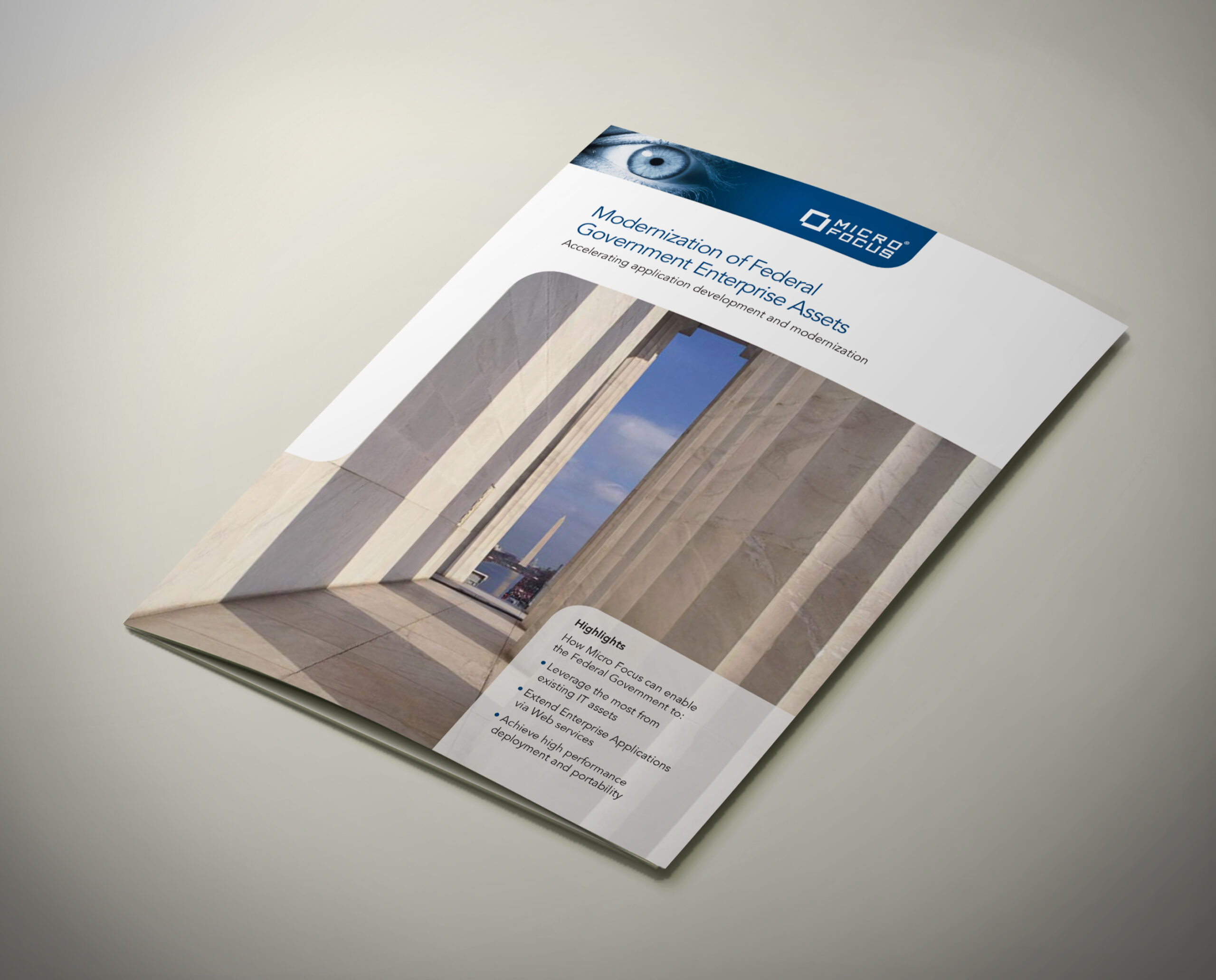
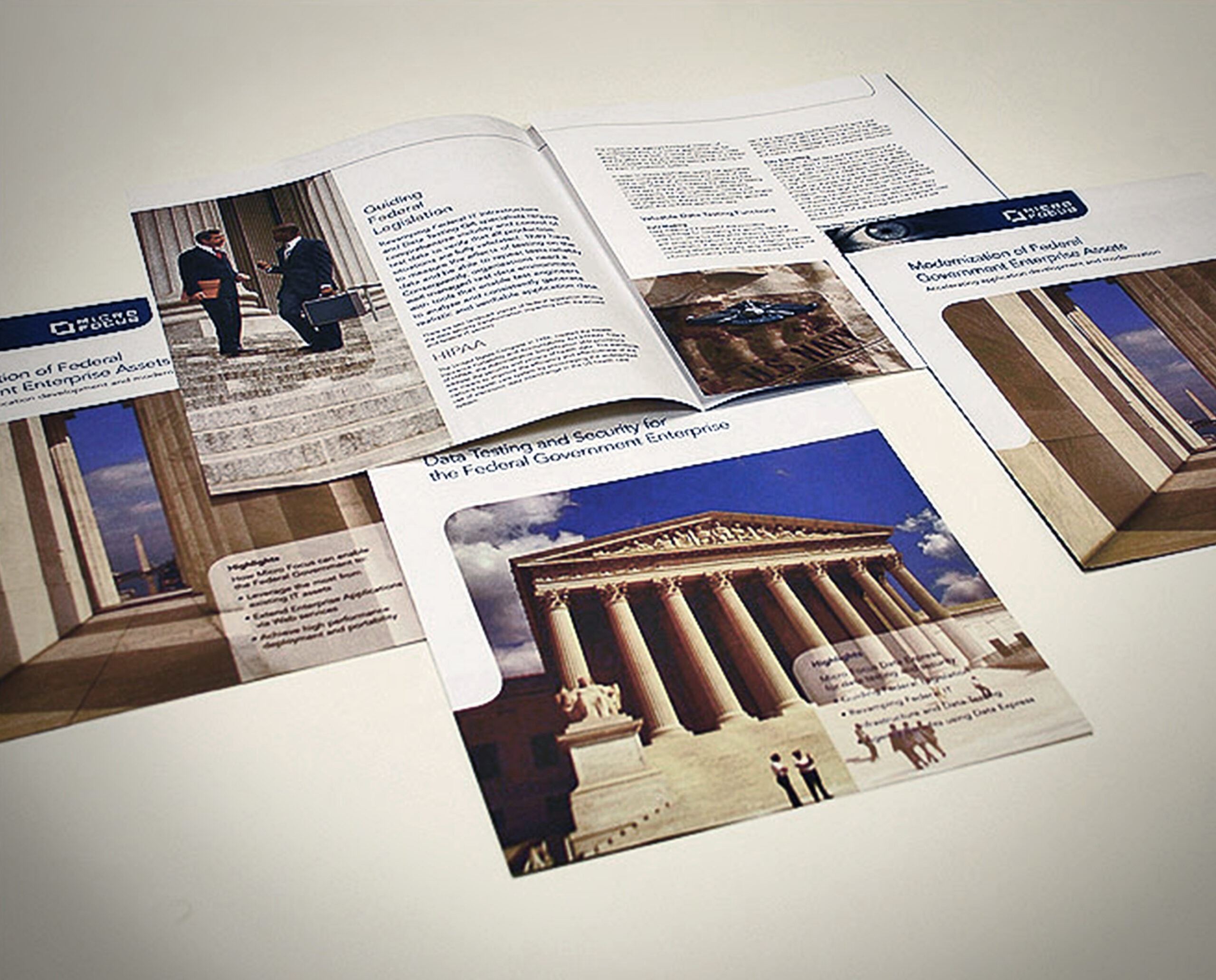
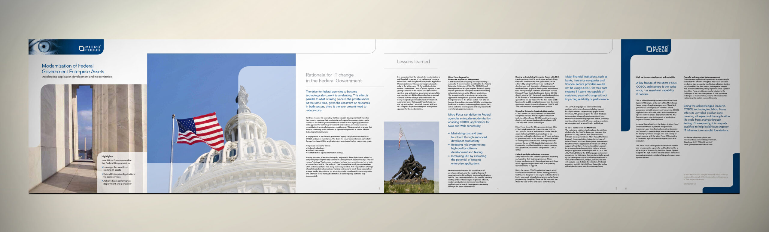
MICROFOCUS
Branding / Collateral
CHALLENGE: Micro Focus, a global leader in enterprise software and IT solutions, needed to develop collateral materials for tradeshows and customer engagements that effectively reflected its innovative and future-focused brand identity. The goal was to introduce a fresh, contemporary aesthetic to strengthen brand perception.
SOLUTION: Drawing inspiration from the existing branding, we crafted a fresh identity that could seamlessly integrate across all their marketing materials. Furthermore, we developed the brand’s messaging and cultivated a tone conveying knowledge, trust, and innovation values.